
Every time I think I have the structure of my site finished I am destined to learn I am wrong. After the latest update to WordPress, I noticed that the mobile version of my site didn’t look right. It looked pretty awful in fact. I set out to figure out why.
The Problem
When I first created the theme that I use for this site, I didn’t want to do any real work to get it looking good on mobile. WPTouch is a great plugin if you want to save some time. Install the plugin, change a few settings, and now you have a good looking mobile site without having to do any design work!
Before I go on, I want to say that this article isn’t sponsored, nor is it meant to be a criticism of WPTouch. The problems I had led me to choose a different solution, but that doesn’t mean I no longer recommend WPTouch if you want to save the time.
Dreamhost automatically updates my WordPress sites for me. The latest update happened with no noticeable problems, until I decided to load up my website on a phone. It didn’t look right at all. The theme that WPTouch uses by default didn’t seem to be loading properly. I checked my other sites and they had the same problem.
I figured it was an issue with the new version of WordPress not being compatible with the plugin. Perhaps there is an update with a fix incoming? I googled around and searched forums to see if anyone else was having the same issue but came up empty.
I decided to try another approach. Instead of relying on WPTouch, I would try and make my theme more responsive.
The Fix
The first thing I tried was to reduce the empty space on the site.
.site
{
	margin-left: 10%;
	margin-right: 10%;
	min-width: 0;
}
This helped a little, but there was still way too much noise on the mobile site.
The sidebar and the content is never going to fit on such a small screen. Since the sidebar doesn’t really contain anything important, the easiest solution here is to just hide it. You can use @media to use different css based on the size of the screen.
@media screen and (max-width: 45em)
{
	.site .site-content .widget-area
	{
		display: none;
	}
}
In our case we are just hiding the sidebar. It’s still not quite there though.

This is easy enough to solve. We just set the margin to zero. We also reduce the size of the font so that more information can be displayed on the mobile version of the site.
@media screen and (max-width: 45em)
{
	.site-main, .site .site-content article
	{
		font-size: 0.8em;
		margin: 0;
	}
}

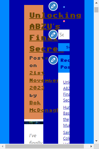
It’s still not quite there yet. The screenshot above doesn’t show how bad it is, but the footer on each article in a list takes up too much space on a mobile device. While it’s fine on a laptop or desktop, it makes it seem cluttered on a mobile device. I decided to get rid of this so that the focus is drawn to the actual content.
@media screen and (max-width: 45em)
{
	.site .site-content article .entry-footer
	{
		display: none;
	}
}
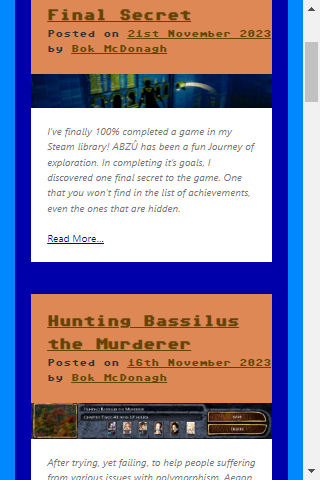
Now it’s much easier to browse the site’s content.
One part of the site that was responsive by default was the menu button. Unfortunately it doesn’t look great.
A small bit of CSS fixes this.
.menu-toggle
{
	background-color: #0000AA;
	color: #0088FF;
	border:0px;
	border-radius:0px;
	width: 100%;
}
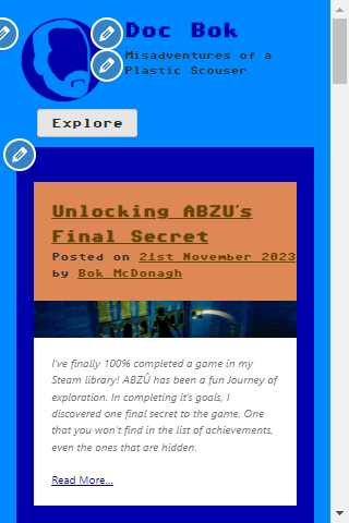
We now have a menu that looks good on mobile as well.
One more thing I needed to do was to tweak the site’s footer. It now displays at a good size on all versions of the site, and includes a copyright notice.
I worked on the CSS a bit more, tweaking margins and font-sizes on a few different elements, and now I have a website that looks just as good on mobile as it does on desktop.
The Benefits
It was time to remove WPTouch from my list of plugins. I want to reiterate that I still recommend the plugin. It can save a lot of time, especially if you aren’t used to creating responsive themes. But there are some benefits to creating a custom theme that is responsive:
- Parity
The style of the mobile site now matches the style of the desktop site. Despite having some layout differences, you can tell just by looking at them that these are the same site. - Optimisation
When it comes to optimisation, we can generally apply them to both sites. While there are still some differences, most of the underlying PHP, JavaScript, HTML, and CSS is the same. Rather than having to think of the two platforms as separate, we can modify both at the same time. - Minimalism
Sometimes less is more, and relying on less plugins is always good. Plugins can add bloat that your website doesn’t need, so being careful to select what plugins you rely on is important. Not every site needs every plugin. While WPTouch has served me well up to now and I would still recommend it to others, it’s time to say goodbye to it on this domain.
So maybe this will be the last major modification I will make to this site. The site is done now. No more changes beyond extra content. That’s it. It’s perfect now.
“Art is never finished, only abandoned.”
– Leonardo da Vinci